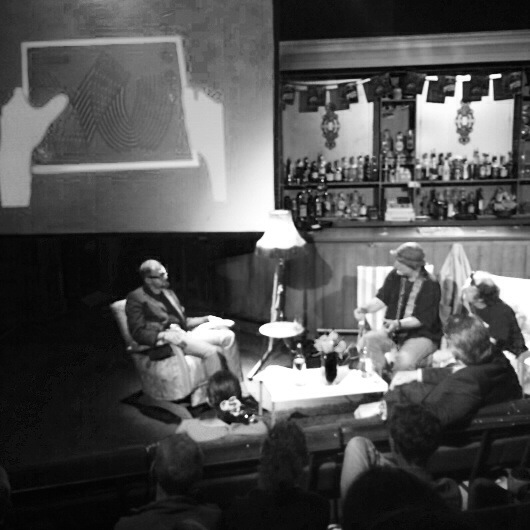
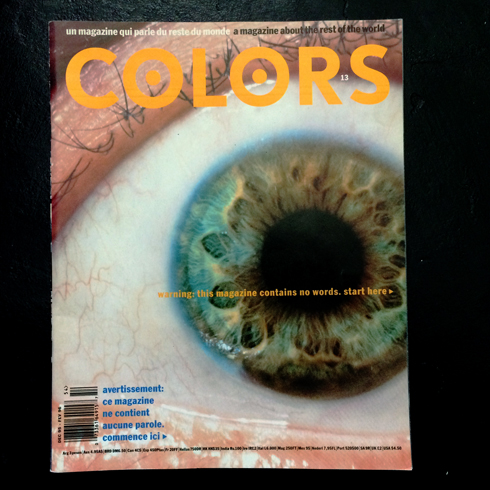
It sounds mad in this day and age but only a handful of people get to work with for a master. On Tuesday night at the the EDO event in London Fernando Gutiérrez talked about his time with Tibor Kalman and the legendary pictures only issue of Colors magazine. I actually heard someone behind me gasp when a few of the pages came up. It was obviously news to him in away to many of us it, and Kalman, are part of art and design folklore.
This has been adapted form short film I appeared in for Innovations at Work. Originally published as a short film here.
What was the first major breakthrough in terms of using colour in design?
I think that the major moment in designing with colour is the leap to the reproduction of colour photography. Most brilliantly made relevant by the fashion mags of the early fifties and paving the way for all modern editorial and advertising. It was particularly influential on advertising. The ability to represent products in full colour had an incredible influence over how we communicate ideas about products and their places in our lives. It drove consumerism on in a way that is hard to imagine now.
John Berger said “Seeing comes before words”. How is this useful as an idea? Colour photography it is the most information in the quickest, most primal form. More than a headline or a column of text.
The London specific January-Grey Pantone looks even deeper through the windows of Google’s Technicolor offices. Not only did we have a fascinating meeting but we were given The Tour. Their office is spectacular in many ways. Not just the incredible views of London but the myriad facilities. On the face of it it is not unlike the Wieden + Kennedy scene in Portlandia where a new advertising employee is – hopelessly – trying to get to their meeting past a host of creative endeavours and holistic activities.
“Technical equipment enabled me to realise my world of signs”
Sitting in the Museum Fur Gestalt, Zurich, watching footage of pre-eminent typographer Wolfgang Weingart in his archives it was hard not to be moved. A man sits surrounded by his life’s work telling the stories of how each artefact came to life.
It has been a very inspiring couple of days at Soho Create in London. It would be hard to sum up but I have to say that if I heard a reoccurring thing it was the inspiration of Punk and its DIY ethos. Apart from that – somewhat unpredictable – subject it really became a list of diverse insights and anecdotes from some very diverse people. There were also quite a few reference to a time before all sorts of digital influences – Google, Wacom, ProTools, Adobe and social media. It wasn’t really lamented – more celebrated and created some great analogies.
I have been developing a short worksheet over the passed year or so for certain jobs. Its purpose is to collate the different influential factors on a rebranding or redesign of content brands – in this instance one thats sits on multiple platforms. It I have been using it in lieu of user research but I think it would sit well with it or before it on many of my more recent jobs. The most recent time I used it I felt I didn’t have a strong enough starting point before I undertook the trust part of the work. We shred the document between the key figures of the job and I quickly got back this great picture of where we needed to go.
Unit Editions, design book publishers, hosted a talk to celebrate the success of their amazing book Manuals 1: Design & Identity Guidelines. The panel consists of Sean Perkins (North), John Lloyd (Ex-Lloyd Northover) and Tony Brook (Spin/Unit). The discussion was hosted by Adrian Shaughnessy.
It opened a tribute to Massimo Vignelli who passed away earlier in the week. In the winter he had written the forward for the book and provided much encouragement and excitement about the project. Some of his quotes set the tone for the evening including:
“Anyone who says that a manual is a creative straight jacket is a moron. Without a manual you will end up speaking a dialect. A good manual allows you to speak a language” Massimo Vignelli


